During my research into visual Languages that emphasize clarity, I came across an article on microsoft.com about Modern design at Microsoft. Context: Microsoft has united around design principles that are modern, intuitive, and implemented through a playful visual language that extends into their entire product portfolio. These principles are characterized by vibrant and dynamic typography, color, and motion while staying away from ornamentation or decoration. I found this article and the general Ideas presented very interesting. With lots of questions about certain aspects of the emergence of modern design, I investigated further:
- What influenced this visual language?
- Fundamental principles and how are they used in practice?
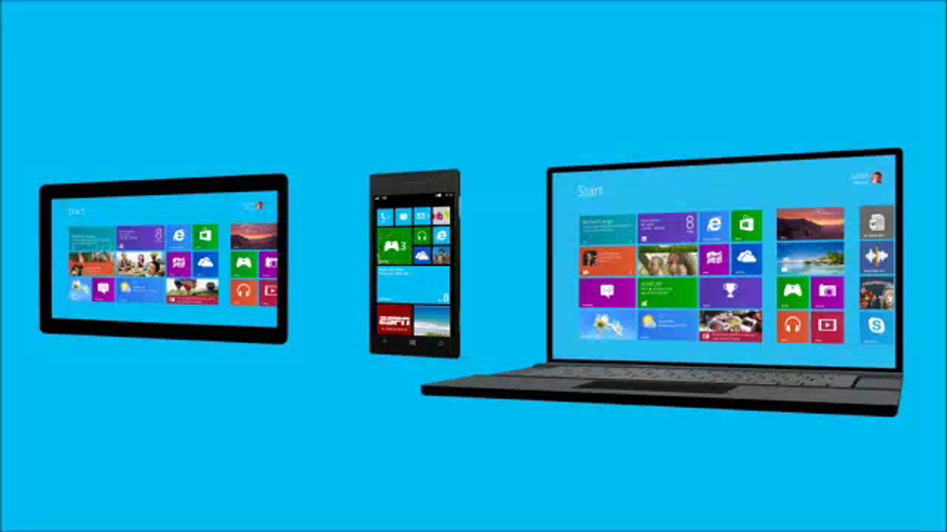
In February 2010 because of how complex and ubiquitous technology was in our lives, Microsoft was determined to refocus on people and place a greater emphasis on consistency of design across its products and services into a unified user experience. In order to achieve this, Microsoft sort to establish principles for this new approach based on influences like the Bauhaus philosophy of stripping away superfluous decorations so as to focus on the essence of the functional which is the hallmark of the New Typography-Modern Design Movement popularized by practitioners like Herbert Bayer and Jan Tschichold.

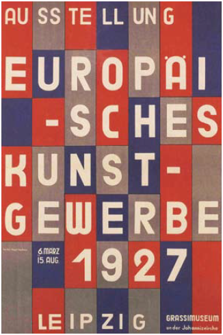
The second influence came from the famed International Typographic Style (or Swiss Style) that emphasizes cleanliness, readability and objectivity. The hallmarks of Swiss Style are great typography, a focus on layout and grid systems, and the use of bold, flat color. It’s a style that is seen in way-finding signage at airports and other transportation hubs.
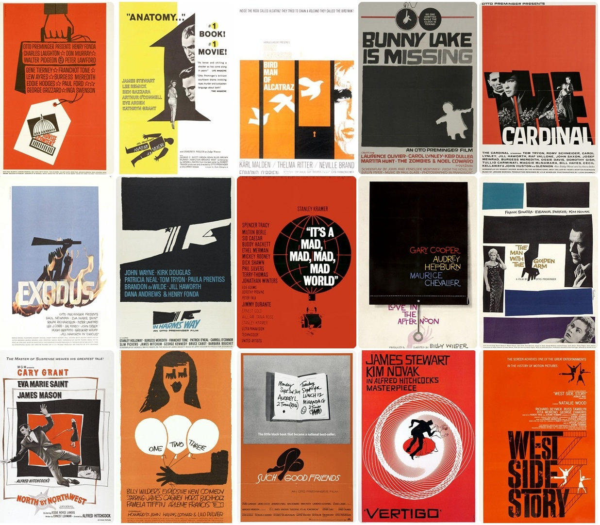
The Last and final influence was the field of Motion design where designers like Saul Bass best known for his design of motion picture title sequences that set an emotional stage for films, film posters, and corporate logos.
Microsoft used these 3 influences to come up with their 5 design principles for the Modern design visual language namely:
- Pride in craftsmanship: Devoting time and energy to small things that many will see often.
- Fast and fluid: Products that feel immersive and responsive are compelling, delightful and bring the interface to life.
- Authentically digital: Going beyond the rules and properties of the physical world to create new and exciting possibilities in a purely digital realm.
- Do more with less: focus on only what is needed — reducing to the essence and celebrating content.
- Win as one: A series of consistent experiences.
I am particularly fascinated by how Four hundred designers from across the company, representing every design discipline at Microsoft, gathered to discuss the principles and share how they were applied. This if anything demonstrates the idea that we should involve as many people in idea generation and development as possible (Ind, Fuller, & Trevail, 2012) because the result of the work Microsoft undertook to create this very unique visual language truly demonstrates how design based on the pursuit of visual Clarity and minimalism make for good inspiring design.
My aim going forward is to utilize the principles Microsoft developed in order to develop my own visual language.
References:
Clayton, S. (n.d.). Modern Design at Microsoft. Retrieved January 5, 2015, from Microsoft: http://www.microsoft.com/en-us/stories/design/
Design at Microsoft. (2013). Retrieved january 5, 2015, from microsoft.com: http://www.microsoft.com/design/
Armstrong, H. (2009). Graphic Design Theory: Readings from the Field. Ne w York: Princeton Architectural Press.
Ind, N., Fuller, C., & Trevail, C. (2012). Brand Together : How Co-Creation Generates Innovation and Re-energizes Brands. Kogan Page.