I thought I would take the time to do some research on some visual fundamentals that underpin most if not all aspects of design i.e. the visual structure and organization of elements within a design; particularly the process of combining distinct parts or elements to form a whole. some elements of composition are:
 Positive and negative space
Positive space being a form or object that, to the eye, appears to exist. while Negative space is everything else around or within an object that is to say, the “empty” space left over.
Point and line
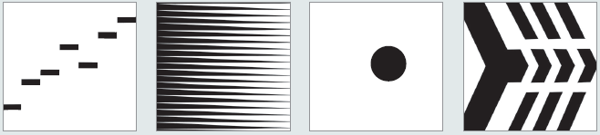
Points exist in their own right as points in space (dots), but are also the start of lines while a line is a pathway between any two points. It can be straight, curved, thick, thin, horizontal, diagonal, jagged, solid, or broken.
Figure and ground
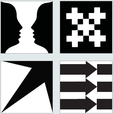
- Figure ground relationships produce different effects that confuse the eye. For example, the Rubin vase (top left) relies upon a visual confusion between figure and ground, so that the eye sees either faces or a vase.

A form is always experienced in relation to the space it occupies and to other forms that may be present in the format.
The law of closure
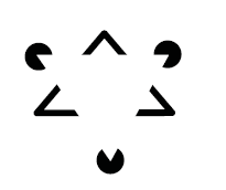 The law argues that we tend to “close” or complete lines or objects that are not, in fact, closed.
  Symmetry
A spatial relationship between elements, and specifically to a situation where the elements in a layout are centred, having equal space to the left and right, or above and below them. while Asymmetry is a composition where elements are juxtaposed and do not mirror the other forms on the page.
layout
The organization of disparate material that makes up the content of a design. the aim of this is to present information in a logical, coherent way, and to make the important elements stand out.
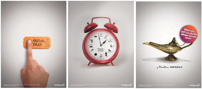
Pace and contrast
vital qualities for maintaining a reader’s interest in a design by providing variety.
Coordination and identity
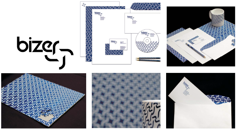
Few things are designed to work as standalone pieces. Look at a successful corporate identity: the logo, advertising campaigns, direct mail pieces, and annual report all have common design elements, binding them together and identifying them as part of the same set.
components of coordination and identity:
- Unity
- Central themes
- Schematic
- Minimalist
- Unity through diversity
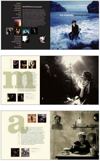
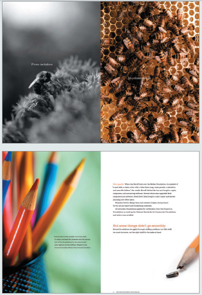
 Photography and illustration
A well-coordinated look is a hallmark of good design, and the way we plan, edit, and incorporate images significantly affects the outcome.
With this research, I can move on with the much-needed knowledge and understanding of what constitutes a good composition. Am actually surprised that I found some concepts I didn’t quite understand but can now see their significance for example: the use of Symmetry in compositions (I tend to favour asymmetrical design and layouts).
References:
Dabner, D., Calvert, S., & Casey, A. (2012). The New Graphic Design School A Foundation Course in Principles and Practice. Wiley.